Good day everyone,
In the next episodes of Learning Designcheck.ai, we’ll focus on the art of communicating the essentials in marketing communications. Traditionally, we focus on the areas we most often recommend improving when evaluating marketing materials. This time, we’ll look at the core message.
We often find multiple messages on marketing materials – in visual or text form. The number of these messages is often influenced by the fact that there are several departments working on it, often in good faith, with different objectives. And having clear objectives is good, but how many can our customers pick up on?
Shoppers usually take in a minimum of information
Our brains prefer to operate on autopilot and therefore love simplicity (more on this in the last episode). At the same time, we have limited time to shop and our needs and motivations change throughout our buyer journey.
The time a customer is willing to give us varies by their shopping mode. In an FMCG retail environment, we talk about a few seconds, whereas when choosing a new car in a showroom it can be tens of minutes. Where does your category stand right now in terms of time and what kind of buying mode is the shopper in? If you know the answers to these two questions and work with them in your communication, you can be pretty sure that the customer will be able to “read your message to the end” :-).
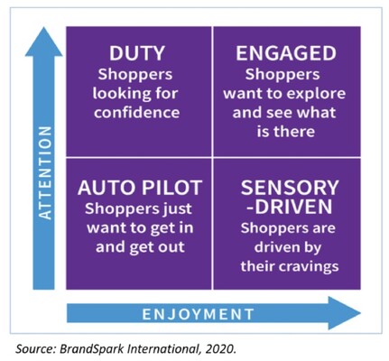
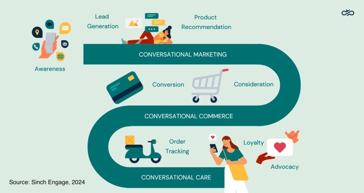
Another thing that helps to fine-tune the core message is a good understanding of the customer’s needs along their customer journey. For example, in the warmth of the home, the quality and reputation of a brand can generate interest in a product. In a busy store and surrounded by competitors, for example, the right size and form of packaging for the current need (holiday, birthday, dinner for two…) or an interesting novelty will pique the customer’s interest.
If we can target the right need to arouse buying interest and the message is clear and simply formulated, our marketing communication will gain momentum.
Let’s be clear about one single thing we want to say
In order to be relevant to the customer and trigger the need to buy, we need to clearly define the main message we will use at a given point (touch-point) and time of use of the marketing material.
Most often, we answer the question of why we are setting up the activity and what the main objective is. Once we know the objective, the key visual and textual elements must lead to that single objective. And if the customer only gives us a few seconds of their time, be prepared to sacrifice graphic elements (information) on the altar of simplicity that do not lead to the goal and divert attention elsewhere.
Let’s communicate this one thing simply in the CTA
The headline or CTA itself is very closely linked to the main message. In my experience, you’ll find the best CTA inspiration from online giants like Amazon, Netflix and others. Their advantage is that they have instant access to data about the performance of the communication, as well as a sophisticated methodology for A/B testing headlines or CTAs.
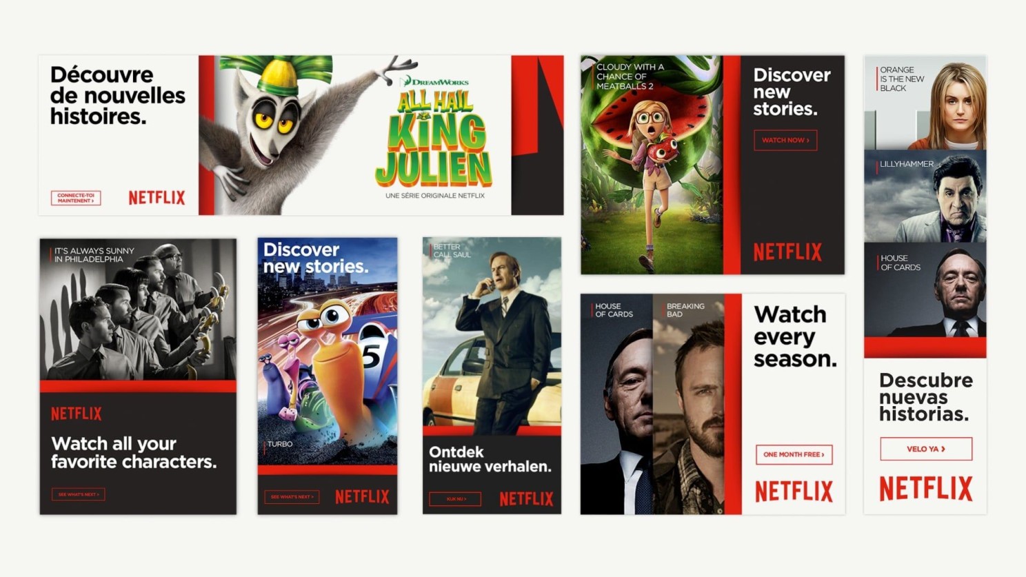
A strong headline contains a call to action, responding to the needs of customers by offering a benefit that will lead them to buy our product and not the competitors :-). A well-written headline should not exceed 5 words in length and is graphically linked to the brand or product so that both are well connected and remembered.
In the next episode of Learning Designcheck.ai, we’ll look at building a design from the perspective of hierarchy and making information easy to read.
Have a great day,
Honza from Designcheck.ai
